

Lead Designer: Boston Gordon
Whistl is a mobile tool to help everyday people get involved in direct action activism.
The Problem
Grassroots activism has relied on collectives of people to organize protests, boycotts, and petitions in order to further the causes of the people. There is no one place where the efforts of organizers and collectives can be found in one place so that eager individuals can find ways to get involved in political actions. I set out to design an all encompassing tool for citizens to get involved in direct actions to change their communities for the better.
The solution was to create a user focused events application with a simple and visually pleasing search function so that everyday people can get directly involved in activism within their communities. Users can create profiles, find and favorite events, share events with friends, and create their own events as organizers on the platform.
User Research
I created a user survey to capture how individuals felt about a direct action application. User results were telling: people are involved and want to be more involved than ever during the modern political moment. Participation in all types of direct action were high across survey respondents.

Overwhelmingly participants said they were recommended actions by friends: 97% of respondents learned about actions this way. More than 70% of participants said they would use a direct action application where they could find and share events and actions with friends.
Competitive Analysis
In order to find the right market and space for my app I compared potential competitors: Golden, Joulebug, and Deed. I wanted my app to be for organizers and individuals. For people who want to do actions from home or go out in the streets or volunteer with those in need. I wanted to take the same ideas and apply them to all the ways people use their actions, voices, money, and organizing to change the world.
Personas
My product needed to account for a diverse swath of people interested in regular and consistent use. It needed to be user friendly, secure, and encompass all the features a serious active user would want. My personas were composites of the people I spoke to and the results of my user surveys. They represent politically curious folks, long time organizers, and everyone in between.
User Stories and Flows
Based on the feedback from my user survey, my research of similar products, and the scope of my personas, I had a good idea of what actions my prototype would prioritize. My high priority user stories would encompass: Signing up for an account, searching for actions, seeing details of actions and organizers, saving actions, and viewing saved actions.
I charted out and diagramed user flows for each of these user tasks in order to best organize how each task would be accomplished.
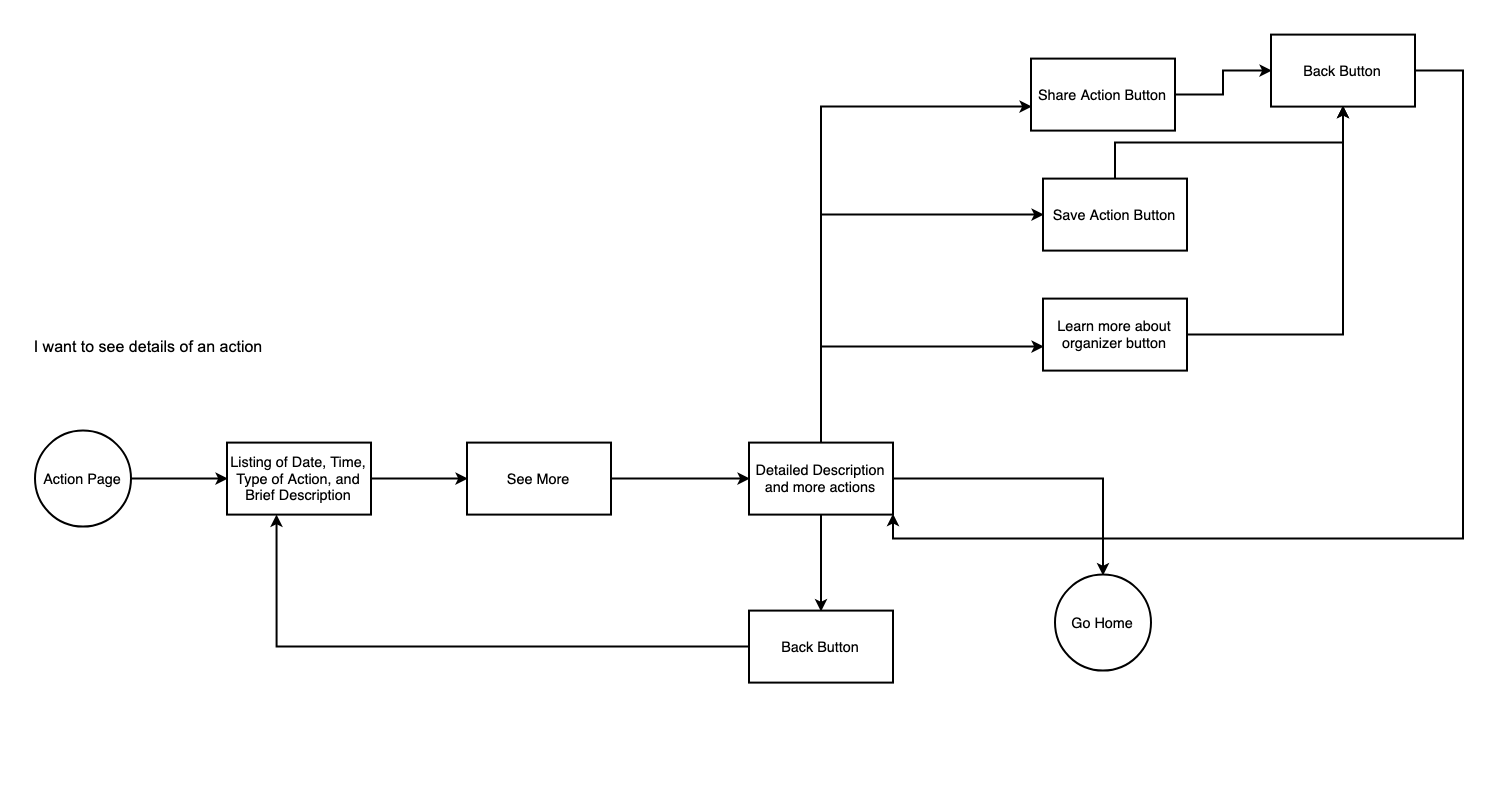
The user flow charting how a user will see the details of an action.
Prototypes and Testing
With user tasks and flows and my vast audience in mind I sketched iterations of the app. I focused my design on simple navigation in order to provide a simple map of how users could get from account onboarding to saving an action within minutes.
I completed lo-fi mockups of these designs so I could have my product interface fully realized and ready for branding and testing.

Branding
Whistl is the call to users to get involved, engaged, and interested right now. The logo includes the name of the product with lines coming out the end like sound waves out of a bullhorn or whistle. The colors I chose suggest urgency: dark red, navy blue, and goldenrod yellow. Whistl uses Chivo typeface for headings, and Open Sans for paragraph text. This pairing creates a bold and distinctive look for the product.

Hi-fi Prototype and Testing
After applying the branding I developed to my mockups I tested my first iterations of my hi-fi prototype on three users.

High Fidelity iterations of the user homepage and the event creation screens.
I had each user create an account, perform an action search function, and return to their homepage. All three users pointed out that checkboxes would be better than radio buttons for the second search page. One user was concerned that the white highlight on the navigation bar was hard to read. Overall the users were able to easily navigate through the app, but I made changes according to user feedback.

The navigation bar highlight was changed from goldenrod to maroon for better visibility.

Radio buttons were replaced with checkboxes in order to give users more search options.
Conclusion
I feel confident that I succeeded in creating a product that is sleek, user friendly, and accomplishes the needs of users. A further developed product will include details on user settings, organizing events, and sharing actions with other users. I think ways for people to communicate with other users could be an advanced feature.
Whistl stands out by providing an all in one product for users to find direct actions and easily have all the information about participating in them in one clean and secure place.